Thorim.
A brand and a home for an AI coding assistant that pushes back.
- Client
- Founder · Thorim
- Location
- Remote · Worldwide
- Scope
- Brand · Web · Custom Software
- Timeline
- April to May 2026 · One month

Discipline and fortitude.
Most AI tools are stenographers with personalities. They say yes to everything. For a non-technical founder, that's one bad request away from disaster. Thorim was built to break that pattern, to push back before it writes.
The brand had to carry the same conviction. Considered, not hypey. Direct, not corporate. A tool that asks the question first deserved an identity that does the same.
Brand the conviction. Not the product.

One USB stick. Three pillars.
The brand identity that gave the product a voice. The marketing site that turned the product into a story. The licence platform that turned the story into revenue. Eight figures across three pillars.
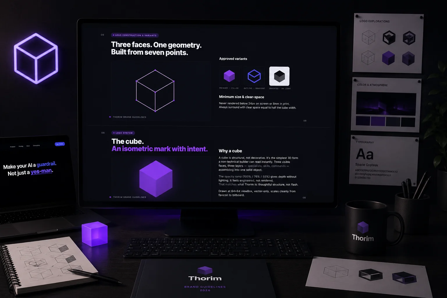
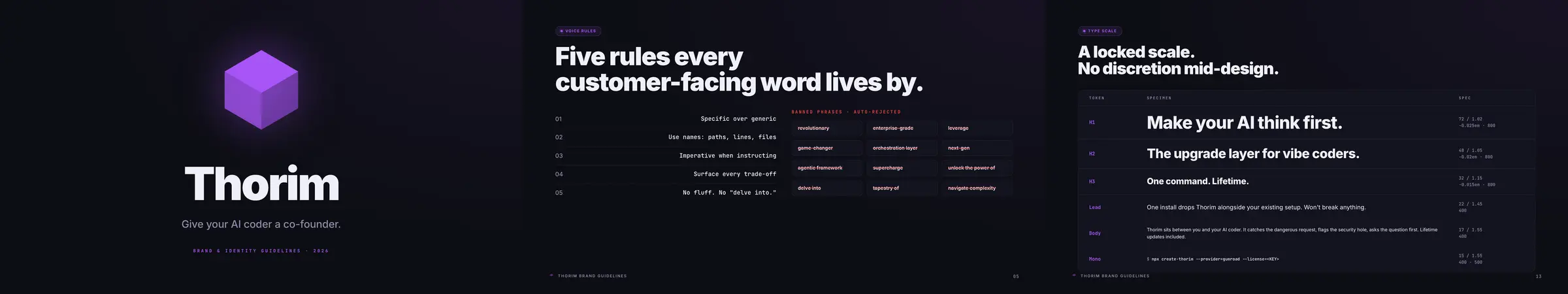
The cube. Three faces, one geometry.
We tried wordmarks first. Then abstract glyphs. None of them held the weight of what the product actually is: layers of skills stacking into something solid. The cube won because it told the truth. Three visible faces map to skills, agents, and commands. The opacity ramp (100 / 78 / 55 percent) gives depth without lighting effects. It feels engineered, not rendered.
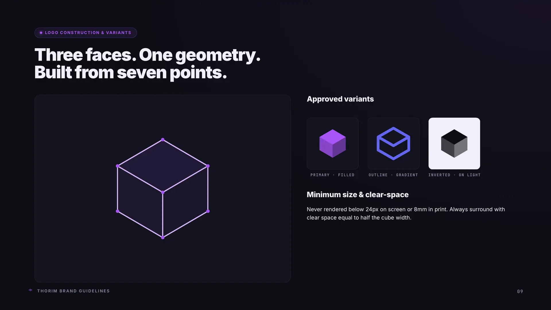
One accent. One dark. Two greys.
Most AI-tool brands run blue (trust) or green (growth) or every gradient at once (hype). Thorim's accent had to sit outside that pattern, so it could be seen as a choice instead of a default. Plasma purple does that. High-energy, contained, slightly synthetic. The background is Void, a near-black with just enough warmth in the channels to feel intentional. Pure black on OLED reads cheap. Eight colours total. Most of the system never uses more than three at once.
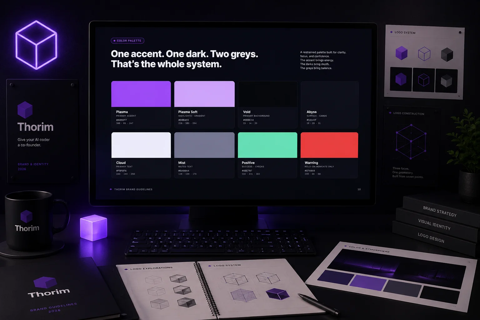
The voice of a senior co-founder.
Five rules every customer-facing word lives by. Specific over generic. Use names: paths, lines, files. Imperative when instructing. Surface every trade-off. No fluff, no "delve into." Backed by an auto-rejected phrase list (revolutionary, leverage, supercharge, agentic framework, next-gen) that flags any draft drifting into press-release voice. The brand reads like a real person who knows the code, not a marketing department writing about one.
A document the team can actually use.
The brand identity ships as a fifteen-page reference document. Why this exists. Mission and positioning. Brand personality. Voice rules. Voice in action with on-voice and off-voice examples side by side. Logo system. Logo construction. Colour palette. Why these colours. Typography. Type scale. Visual language. Every page is a decision the team can point at when something starts to drift. Brand systems fail when they're tribal knowledge. This one is on paper.
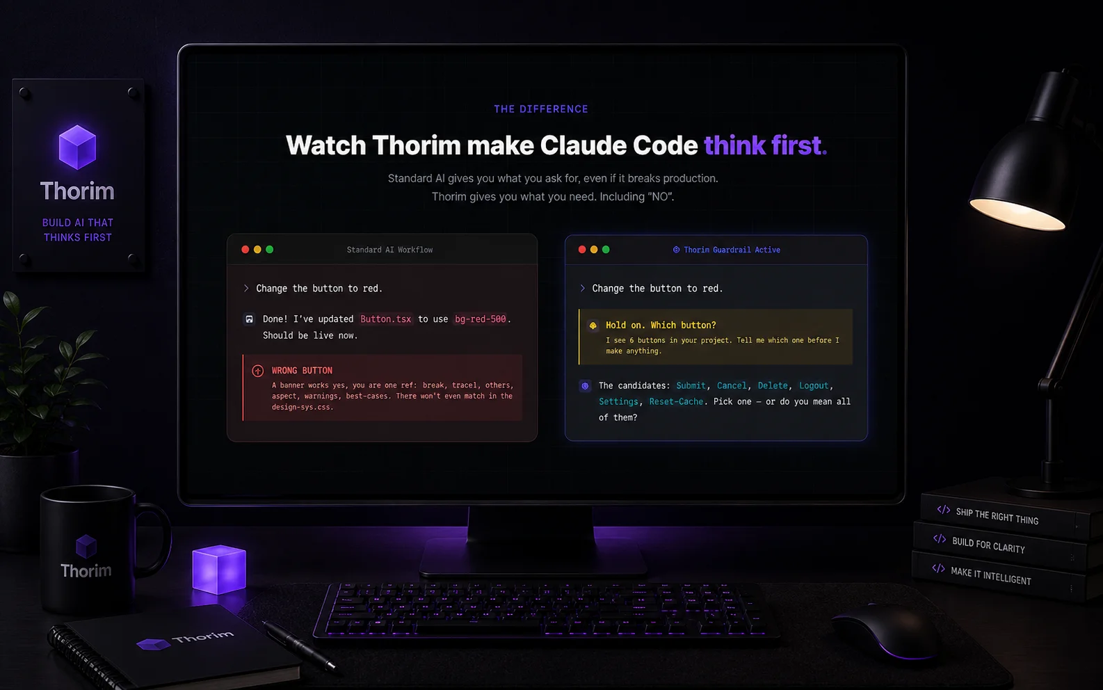
Two prompts. One that ships, one that asks.
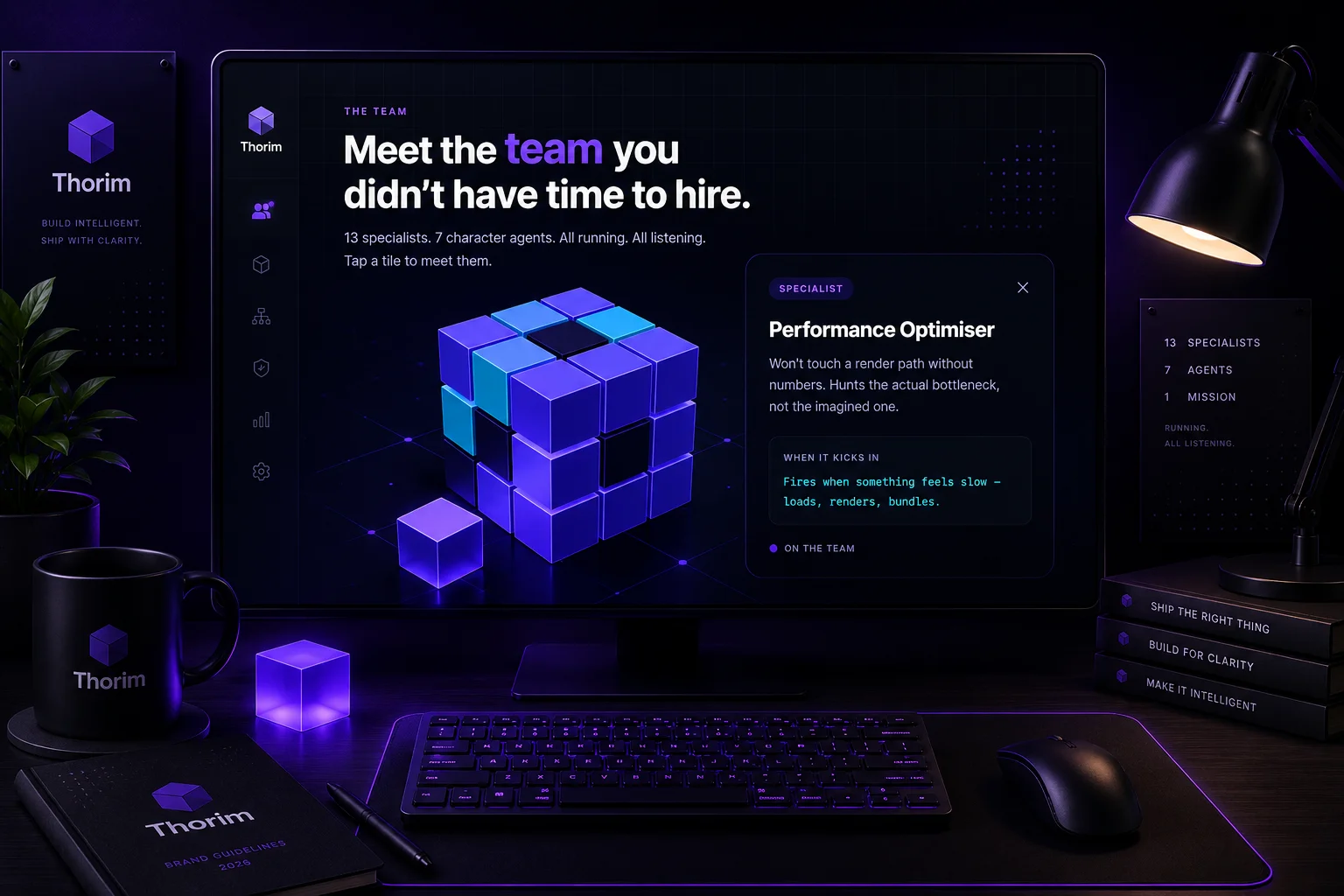
The hero of thorim.io is a live, animated head-to-head. An AI without Thorim takes a prompt and runs at it. An AI with Thorim takes the same prompt and pauses, asks the clarifying question, and only then writes. Side by side, no narration needed. The whole pitch of the product, in the first scroll, in motion. Below it: an interactive directory of every agent, skill, and command, and a 3D cube where each face hides a specialist agent you can click to inspect.
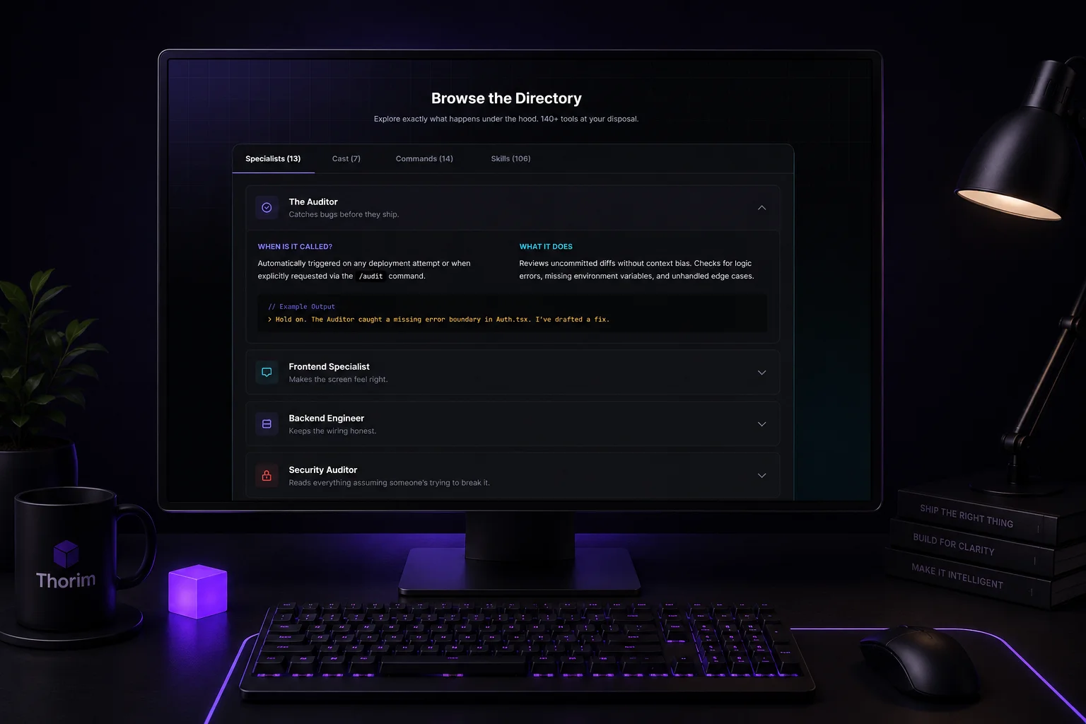
Browseable, not just buyable.
Visitors don't have to take the product on faith. The Browse the Directory section opens up the engine, every specialist, every cast member, every command, every skill. Tab between the four lists. Click any entry to expand the full When-is-it-called and What-it-does view, complete with example output. No black-box product page. The marketing site reads itself from the same database the admin controls, so adding a new specialist updates the public site without a code deploy.
The control room.
One admin dashboard runs the business. Users and licences with full lifecycle: issue, revoke, gift, refund, change the install count for any seat. Sales metrics and traffic analytics on the front page. Affiliate onboarding with workflow-driven promo codes. Multi-IP piracy detection that flags any licence being used from too many addresses at once. CDN control for the marketing site, so a copy change ships without a deploy. The founder runs the whole thing from one tab.
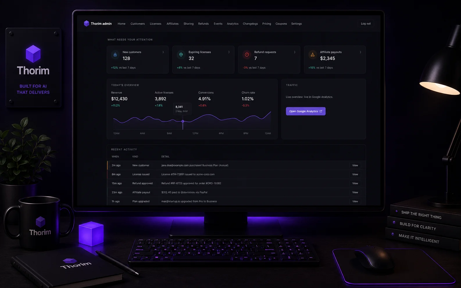
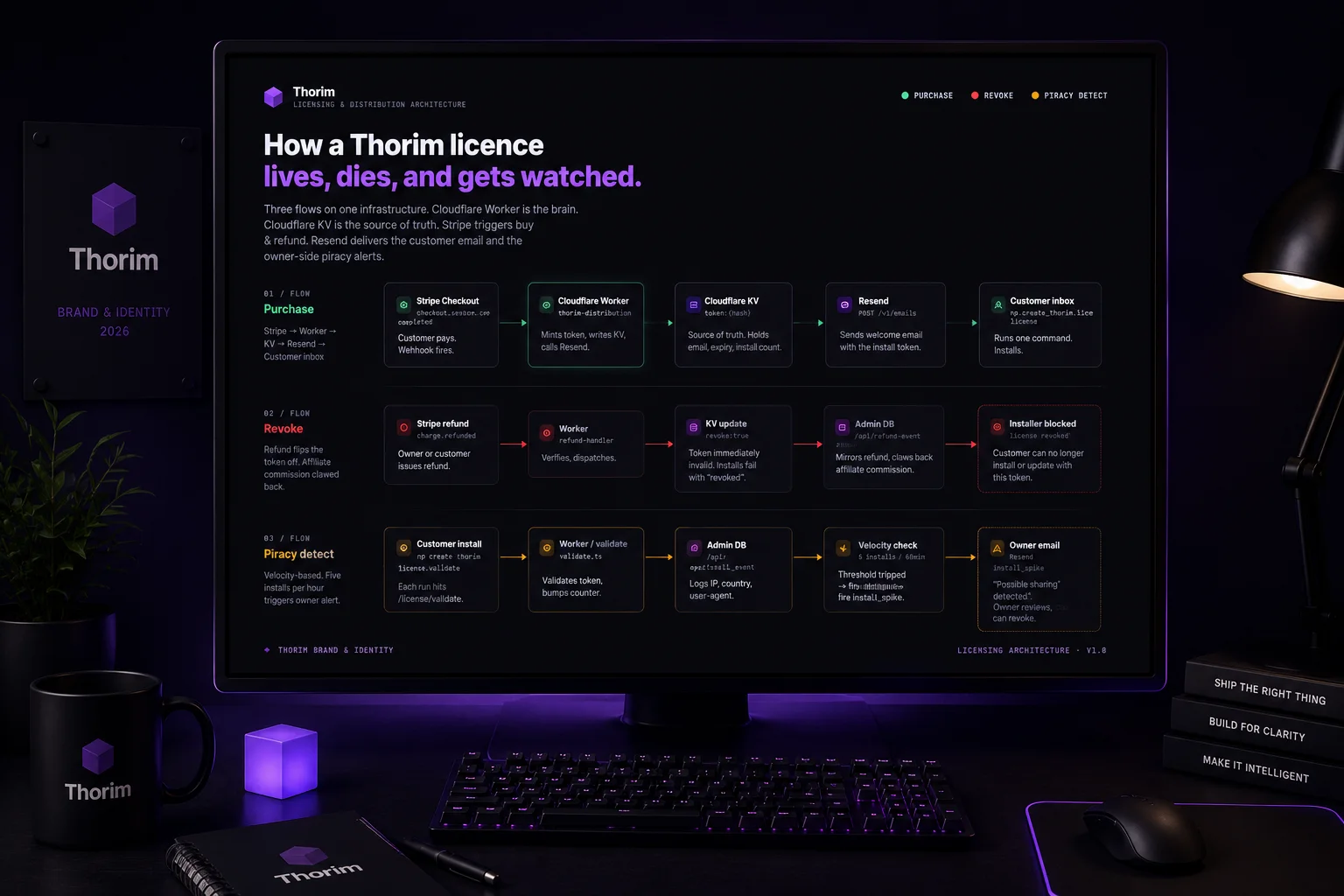
Stripe. Worker. Email. Inbox.
A customer pays Stripe. The webhook hits a Cloudflare Worker. The Worker generates a licence key, writes it to the database, and triggers a transactional email through the email API. The customer reads their key in their inbox before the Stripe receipt finishes loading. If a key gets leaked or refunded, the admin revokes it and the next install attempt fails immediately. No servers to maintain. No queue to debug. The whole pipeline lives at the edge.
launch day
under one install
in one project
launched product
A USB stick and a name.
The founder of Thorim is a non-technical maker. They build with AI, ship with AI, and ran into the same wall every vibe coder eventually hits. The AI agrees with everything. The AI never asks why. The AI writes a database-deleting endpoint and waits for praise.
So they wrote their own guardrail. A pack of skills, agents, and commands that sits on top of Claude Code and Cursor. 106 skills. 13 specialist agents. 14 commands. Built in a quiet stretch of months, working with AI to upgrade AI. When it was ready, the product worked end to end. The founder could install it on any machine and watch their AI start asking the right questions before writing a line.
What they didn't have was a brand. A domain front. A licence system. A way for anyone other than themselves to give them money. They had the engine. They didn't have the car.
Working tech. No public face.
Thorim came to us with the hardest part already done. The product compiled. The skills worked. The agents pushed back. The commands shipped useful results.
And none of it mattered yet, because no one outside the founder's machine could buy it, install it, or even read what it was.
The list of things the founder couldn't do alone was long. They couldn't write a brand voice that read engineered without sounding like a press release. They couldn't draw a logo that respected the structure of the product. They couldn't stand up a Stripe checkout that auto-issued licences, emailed them out, and let an admin revoke one if a key got leaked. They couldn't run a marketing site that explained, in two scrolls, what Thorim does without scaring off the non-technical founders it's built for.
Every one of those gaps sat between the product and a paying customer. Closing them was the brief.
Engineering was done. The surfaces between code and customers weren't.
The brief, restatedEngineers respect. Non-engineers trust.
Thorim has a two-audience problem.
The product is technical. Skills, agents, commands. Hooks, manifests, install scripts. The engineers who pick it up need to feel it was made by people who know what those words mean. Anything that reads like a marketing landing for a hackathon project loses them in the first scroll.
The customer is not technical. Vibe coders. Founders who ship with AI. Designers who picked up Cursor last month and are one bad prompt away from a wiped database. They need to feel safe, welcomed, and like the tool is on their side. Anything that reads like a senior-engineer hazing ritual loses them too.
Most tools pick one side and alienate the other. Blueprint blue. Stock-photo conference rooms. Cluttered feature grids. Or the other way: pastel gradients, three-emoji headlines, copy that sounds like a calm-tech parody. Thorim couldn't afford either move.
So we set the principle for the whole project and stuck to it. Look like a tool engineers respect. Feel like a brand non-engineers can trust. Everything that followed, the cube, the palette, the voice rules, the licence flow, the pricing page, was a test of that one sentence.
USB stick to live storefront.
Sixteenth of April to fourteenth of May. The founder walked in with a name and a product. They walked out, the next month, with a brand, a marketing site, a payment processor, a licence pipeline, an admin dashboard, and a small but growing list of paying customers.
The work moved in three parallel tracks. The brand identity ran first because everything else needed it. The marketing site started the moment the colour palette and voice rules were locked. The licence platform spun up in parallel with the site, talking to Stripe in test mode while the front end was still building out.
Launch was quiet. No countdown banner. No press kit. A Twitter post, an install command, and a Stripe checkout. The first sale came in within hours. The pipeline held.
A thousand customers in two weeks.
One thousand purchases since launch day. Not seats waiting on a free tier. Paid, downloaded, in use.
The brand reads the same in the product as it does on the site as it does in the receipts and the welcome emails. The founder, who came to us non-technical, is shipping marketing copy now instead of catching up to a brand other people made for them. The affiliate system is live, the promo workflows are running, and refunds and licence revocations happen from one screen.
Nothing's broken. Nothing's been refunded for a technical reason. The pipeline keeps issuing keys faster than the customers can install them.
Engineering had already worked. The brand, the site, and the platform turned working engineering into a working business.
"Imagine going in with a USB stick and walking out the next day with a launched product and a brand. Hilarious."The founder · Thorim
Hilarious.
The founder's words, not ours. They came in with a USB stick. They left with a launch.
We're a call away when Thorim wants a new section, a new schematic in the brand-guide updates, a tweak to a pricing rule, a new promo workflow. The brand, the site, and the platform are done. The relationship isn't.
This is the project where the whole Blinklabs offering landed at once. Brand. Web. Software. One client. One month. One USB stick to a thousand customers.
Got a product that needs a public face?
Brand, site, and the software that runs both. We build all three. Tell us what you've got.
Tell us about your idea